Step 2. Setting up some animations
Goals
To facilitate understanding, we will visualize certain aspects of the simulation throughout this tutorial. In this step, we will focus on the physical layer, most notably radio transmissions and signal propagation.
The model
Visualization support in INET is implemented as separate modules that are optional parts of a network model. There are several kinds of visualizers responsible for showing various aspects of the simulation. Visualizers are parameterizable, and some visualizers are themselves composed of several optional components.
The visualizer submodule in this network is an
IntegratedCanvasVisualizer, which is a compound module that contains
all typically useful visualizers as submodules. It can display physical
objects in the physical environment, movement trail, discovered network
connectivity, discovered network routes, ongoing transmissions, ongoing
receptions, propagating radio signals, statistics, and more.
We enable several kinds of visualizations: communication range, signal propagation, and recent successful physical layer transmissions.
The visualization of communication range is enabled using the
displayCommunicationRange parameter of the radio module in host A.
It displays a circle around the host, which represents the maximum
distance where successful transmission is still possible with some hosts
in the network.
The visualization of signal propagation is enabled with the
displaySignals parameter of MediumCanvasVisualizer. It displays
transmissions as colored rings emanating from hosts. Since this is
sufficient to represent radio signals visually, it is advisable to turn
off message animations in the Tkenv/Qtenv preferences dialog.
The visualization of recent successful physical layer transmissions is
enabled with the displayLinks parameter of the
physicalLinkVisualizer submodule. Additionally, its packetFilter
parameter is set to only display packets whose names being with
“UDPData”. Matching successful transmissions are displayed with dotted
dark yellow arrows that fade with time. When a packet is successfully
received by the physical layer, the arrow between the transmitter and
receiver hosts is created or reinforced. The arrows visible at any given
time indicate recent successful communication patterns.
Configuration:
[Config Wireless02]
description = Setting up some animations
extends = Wireless01

*.hostA.wlan[0].radio.displayCommunicationRange = true

*.visualizer.sceneVisualizer.descriptionFigure = "title"

*.visualizer.mediumVisualizer.displaySignals = true

*.visualizer.physicalLinkVisualizer.displayLinks = true
*.visualizer.physicalLinkVisualizer.packetFilter = "UDPData*"
Results
The most notable change is the bubble animations representing radio signals. Each transmission starts with displaying a growing colored disk centered at the transmitter. The outer edge of the disk indicates the propagation of the radio signal’s first bit. When the transmission ends, the disk becomes a ring and the inner edge appears at the transmitter. The growing inner edge of the ring indicates the propagation of the radio signal’s last bit. The reception starts when the outer edge reaches the receiver, and it finishes when the inner edge arrives.
Note that when the inner edge appears, the outer edge is already far away from the transmitter. The explanation for that is that in this network, transmission durations are much longer than propagation times.
The UDP application generates packets at a rate so that there are back-to-back transmissions. Back-to-back means the first bit of a transmission immediately follows the last bit of the previous transmission. This can be seen in the animation, as there are no gaps between the colored transmission rings. Sometimes the transmission stops for a while, indicating that the transmission queue became empty.
The blue circle around host A depicts the communication range, and it clearly shows that host B is within the range, therefore successful communication is possible.
The dotted arrow that appears between host A and host B indicates successful communication at the physical layer. The arrow is created after a packet reception is successfully completed, when the packet is passed up to the link layer. The arrow is displayed when the reception of the first packet at host B is over.
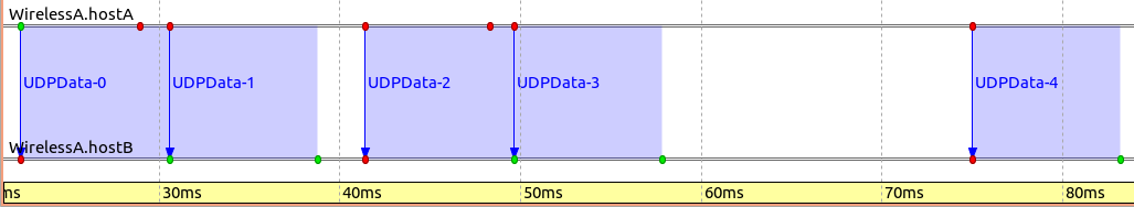
Frame exchanges may also be visualized using the Sequence Chart tool in
the OMNeT++ IDE. The following image was obtained by recording an event
log (.elog) file from the simulation, opening it in the IDE, and
tweaking the settings in the Sequence Chart tool.
The transmission of packet UDPData-0 starts at around 23ms and completes at around 30ms. The signal propagation takes a nonzero amount of time, but it’s such a small value compared to the transmission duration that it’s not visible in this image. (The arrow signifying the beginning of the transmission appears to be vertical, one needs to zoom in along the time axis to see that in fact, it is not. In a later step, we will see that it is possible to configure the Sequence Chart tool to represent time in a non-linear way.) The chart also indicates that UDPData-0 and UDPData-1 are transmitted back-to-back because there’s no gap between them. UDPData-2 and UDPData-3 are also transmitted back-to-back.
Number of packets received by host B: 2017
Sources: omnetpp.ini,
WirelessA.ned
Discussion
Use this page in the GitHub issue tracker for commenting on this tutorial.