Visualizing the Spectrum of Radio Signals
Goals
INET supports the visualization of the physical properties of radio signals in the temporal, spectral, and spatial dimensions in various forms. This visualization can help you understand, for example, why a particular signal was received or not received successfully in the presence of interference from other signals or noise.
The visualization can take the form of spectrums, spectrograms, and heatmaps representing spatial power density. This showcase demonstrates such visualizations with three example simulations.
4.6About the Visualizer
MediumCanvasVisualizer can visualize the power density of radio signals using three kinds of figures (in addition to visualizing propagating signals, signal departures/arrivals, and communication/interference ranges, described in the Visualizing Radio Medium Activity showcase).
The module can visualize signals in the following ways:
Spectrum displays the signal power density as a function of frequency at a given point in space, i.e. at network nodes, for the current time. When the spectrum is displayed at the transmitting and receiving nodes, the transmitted/received signal and interference (other signals and noises) can be displayed separately, so they can be compared.
Spectrogram displays the signal power density as a function of frequency and time at a given point in space, i.e. how the spectrum changes over time. The figure uses color saturation for representing different power density values.
Power Density Map displays the signal power density as a function of space as a heatmap, for the current time, at a given frequency.
Note
This visualization only works with the dimensional analog model.
The Probe Module
The Probe module can be used to visualize the total power density of the transmission medium at its position. The probe is technically a network node that contains only an antenna submodule (for directional selectivity), and a mobility submodule (for moving on its own). A probe with StationaryMobility can also be dragged with shift + left mouse click (while the simulation is stopped or running) to examine the total power density of the transmission medium at any point in the network. This can be very useful for understanding what’s going on in the transmission medium and troubleshooting signal reception.
Spectrum Figure
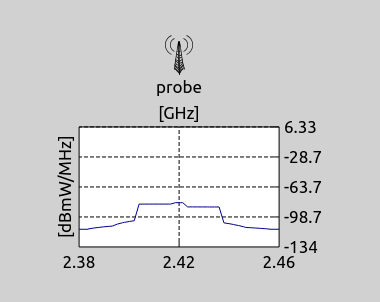
The spectrum figure displays the signal power density over frequency at the current time,
at a given position (such as a network node or probe). The power axis is logarithmic,
and the power density is displayed in units of dBmWpMHz, i.e. dBmW/MHz. The visualization
is enabled with the visualizer’s displaySpectrums parameter.
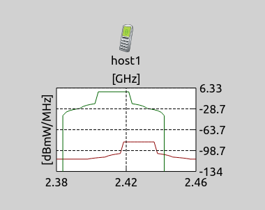
The spectrum plots are color coded. By default, the total power density of all signals is shown at the given position (blue curve), except for the transmitting and receiving nodes, where the transmitted/received signal (green curve) is displayed separately from interfering signals/noises (red curve).
The visualizer’s spectrumMode parameter specifies what to display in the spectrum figures:
total: display the total power density in the transmission medium at that location in blue (visualizes signals at every node)signal: display the power density of the transmitted or received signal in green (only visualizes signals at the transmitting and receiving nodes)auto(default): display the transmitted/received signals in green and interfering signals/noise in red if there is an ongoing transmission or reception at the given node, otherwise display the total power density in blue (visualizes signals at every node)
All spectrum figures, spectrograms, and power density maps in the network share the scales of power density, frequency, and time axes, so the visualizations can be compared. The scales are automatic by default, and they’re determined by the signals which have been seen in the network so far. Therefore, automatic scales can extend over time as new signals are transmitted, but they don’t contract.
The scales of power density, frequency, and time axes can also be specified manually by a set of parameters. There are three parameters for each axis: a minimum and a maximum value, and a switch for auto configuration. For the complete list of parameters shared between the figures, see the NED documentation of MediumVisualizerBase.
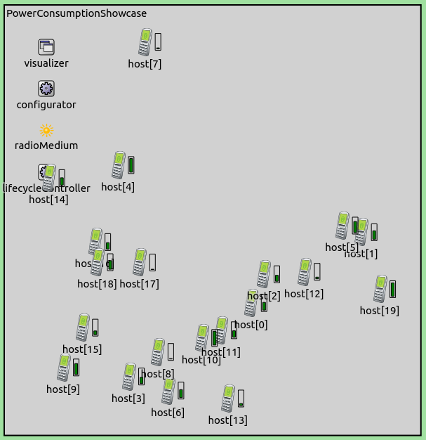
In the example demonstrating the spectrum visualization, two pairs of AdhocHost’s communicate with each other on different but interfering Wifi channels. The simulation uses the following network:
The analog model needs to be dimensional to properly represent the spectral components
of signals, thus Ieee80211RadioMedium and hosts’ radios are configured to use the dimensional analog model
in the General configuration:
*.radioMedium.signalAnalogRepresentation = "dimensional"
In the General configuration, the background noise (IsotropicDimensionalBackgroundNoise
by default due to using the dimensional analog model) is set up. By default, this module uses
the power parameter. However, directly specifying power can only be used when all signals have
the same center frequency and bandwidth; otherwise, the noise power density parameter needs to
be specified.
*.radioMedium.backgroundNoise.power = nan dBmW
*.radioMedium.backgroundNoise.powerSpectralDensity = -113dBmWpMHz
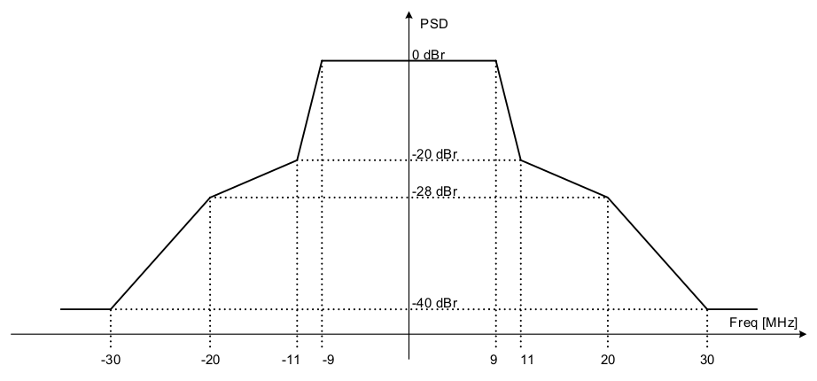
The following sets the radio type to dimensional and configures a more realistic signal shape in frequency (the spectral mask in the 802.11 standard):
*.host*.wlan[*].radio.signalAnalogRepresentation = "dimensional"
*.host*.wlan[*].radio.transmitter.analogModel.frequencyGains = "left c-b*1.5 -40dB linear c-b -28dB linear c-b*0.5-1MHz -20dB linear c-b*0.5+1MHz 0dB linear c+b*0.5-1MHz 0dB linear c+b*0.5+1MHz -20dB linear c+b -28dB linear c+b*1.5 -40dB right"
Note
We’re using linear interpolation instead of log-linear when defining the signal shape, so the specified signal shape is not exactly the same as the spectral mask.
These lines configure the Wifi channels (the host-pairs are on different but interfering channels):
*.host{1..2}.wlan[*].radio.channelNumber = 0	# overridden in PowerDensityMap config
*.host{3..4}.wlan[*].radio.channelNumber = 3	# overridden in PowerDensityMap config
The General section also configures traffic; host1 sends UDP packets to host2,
and host3 to host4.
The SpectrumFigure configuration in omnetpp.ini
simply enables the spectrum figures:
[Config SpectrumFigure]
sim-time-limit = 1s
network = SpectrumShowcaseSpectrumFigureSpectrogramNetwork

*.visualizer.mediumVisualizer.displaySpectrums = true
Here is a video of the simulation:
In the above video, the two hosts start transmitting at the same time. As the spectrumMode
parameter is set to auto, the spectrum figures of the hosts display the transmitted/received
and the interference separately (here, each host either transmits or receives a signal).
The probe displays the total power density of the transmission medium in blue. Note that the
spectrum figures display the isotropic background noise at the bottom of the plot. As the probe
is dragged around, the signal of the host it is closer to appears as the stronger signal on
the spectrum figure. Note that the power density axis scale keeps changing as the transmitted
signals reach the other hosts. The scale also depends on where the probe is dragged;
when it’s dragged further, smaller signal power density is encountered, and the lower boundary
of the scale extends.
Spectrogram
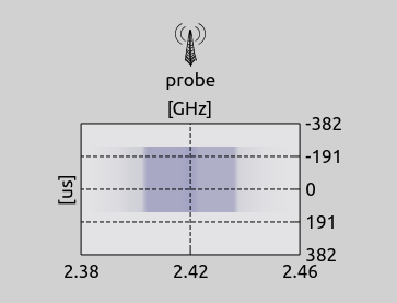
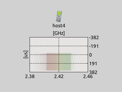
The spectrogram figure displays the signal power density over frequency and time, at a given
position. The figure uses a pixmap to display the power spectral density along the X axis;
the magnitude is represented by color saturation. It uses the same color coding as the spectrum
figure - blue for total power density, green for transmitted/received signal, and red for
interfering signals and noise. Along the time axis, zero corresponds to the current time;
positive values correspond to the future, and negative ones to the past.
The visualization is enabled with the visualizer’s displaySpectrograms parameter.
Similarly to the spectrum figure, the spectrogramMode parameter specifies what to
display (total, signal, or the default auto). The pixmap’s resolution can be
tuned by additional parameters.
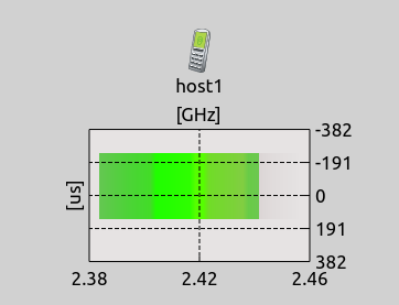
Interference is visualized on the spectrogram as a mix of green and red colors; as such, the proportion of signal and interference can be decoded based on the green and red color intensity in the pixmap.
Note
The intensity of the spectrogram’s pixels depends on the scale. The minimum of the scale corresponds to zero saturation (white); the maximum of the scale to the most saturated pixel. When the power density scale expands, the heatmap can change abruptly; this effect can be prevented by setting the scale manually.
The simulation demonstrating the spectrogram (Spectrogram config) uses the same network
as the spectrum figure case. The configuration in omnetpp.ini
enables the spectrogram visualization:
[Config Spectrogram]
sim-time-limit = 1s
network = SpectrumShowcaseSpectrumFigureSpectrogramNetwork

*.visualizer.mediumVisualizer.displaySpectrograms = true
Here is a video of the simulation:
In the video, the two hosts start transmitting simultaneously. Similarly to the previous simulation, the spectrograms of the hosts display the transmitted/received signal separately from the interference. The signal and interference are displayed as the green and red color channel of the spectrogram. The probe displays the total power density in blue.
The playback speed is lowered a bit before the probe is dragged (the signal blocks move upwards slower on the spectrogram). Note the change in saturation on the different sides of the spectrogram as the probe is dragged closer to each transmitting host.
The blue signal blocks on the spectrograms of host2 and host4 represent both
transmitted signals before being received. When host2 and host4 start receiving
their respective signal, the blocks turn to a combination of green and red.
At host2, the right side of the signal block is green, the left is red; at host4,
it’s the other way around because the two hosts are receiving different signals.
When the transmissions are over, the signal blocks change from green/red to blue at the transmitting hosts, as the signals are no longer transmitted. When the end of the signal reaches the receiving hosts, their blocks change to blue as well.
It is apparent that the ACK is much shorter than the data frame. Also, the data frame is
received at a much lower power than the ACK is transmitted. At host2 and host4,
the signal block representing the ACK has a more saturated color and appears wider;
in fact, the ACK has the same bandwidth as the data frame, but since the data frame’s
power is lower at the receiving node, its block fades into white at the sides.
The first transmissions are not correctly received; host3 retransmits the frame.
This time it’s received correctly and ACKed. Note that there is a larger gap on the
spectrogram between the first transmissions and the retransmissions (channel contention)
than between the retransmission and the ACK (SIFS).
Note that when host2 is done receiving the data frame, the data frame’s signal block
changes to blue for a moment, as the host is not transmitting or receiving. After a short
period, the host starts to transmit the ACK, and the data frame’s block changes to red
(as it is not a signal the host is receiving).
Power Density Map
The power density map figure displays the signal power density over space, at a given frequency, at the current time. It displays the power density as a heatmap, where color saturation represents the magnitude. This feature has two distinct visualizations, which are enabled and configured independently:
Main power density map: displays the total power density of the wireless medium within the network’s boundaries (or in some limited but fixed boundary).
Per-node power density map: displays the power density in the vicinity of network nodes; similarly to the other figures, the
powerDensityMapModeparameter specifies what to display (total,signal, or the defaultauto).
The power density map displays the power density at a specific frequency, which is the
center of the frequency axis by default. The frequency can also be specified manually
be the powerDensityMapCenterFrequency parameter. This parameter (and some others)
can be changed from Qtenv, and they take effect immediately (whether the simulation is running or stopped).
The power density map uses the same color coding as the other figures (green/red and blue). As with the spectrogram, the saturation of the heatmap’s pixels depends on the scale of the power density axis; when the scale changes, the heatmap can change abruptly. The power density map is also susceptible to changes in the scale of the frequency axes, as the figure displays the power at the center of the frequency scale by default, which can lead to abrupt changes as well.
Note
Leaving the powerDensityMapCenterFrequency on auto is primarily useful when all signals are alike in frequency (e.g. same Wifi channel).
The power density map resolution can be adjusted for less or more detail, independently for both the main and the per-node figures. With less detail, the figure becomes more pixelated; with more detail, even if the canvas is zoomed in, the figure still doesn’t become pixelated.
The power density map feature can calculate the heatmap in three modes, controlled by the powerDensityMapPixelMode parameter:
sampling: Use sampling to calculate the heatmap, i.e. sample the power density at the center of each pixelpartition: Calculate and draw the power density using the interpolation of the partitioning of the original multidimensional power density functionmean: Calculate and draw the mean of the power density on each pixel
Sampling is the fastest, but it can lead to loss of detail due to undersampling in some corner cases. Partition is slower and more accurate; it paints coherent pixel areas, potentially painting the same pixel several times, leading to inaccurate pixel colors.
Mean is the slowest, but the most accurate. Note that the powerDensityMapPixelMode parameter
pertains both to the main and the per-node figures; mean by default.
Similarly, the spectrogram figure has the spectrogramPixelMode parameter.
Note
The power density map feature is very CPU-intensive, but the visualization can use multiple CPU cores. For multi-core support, INET needs to be compiled with OpenMP.
The PowerDensityMap configuration uses a similar network as the previous examples,
but without a probe module. The network also contains physical objects which represent
an apartment, and hosts have different positions compared to the previous examples:
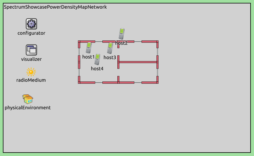
In omnetpp.ini, the main and per-node power density map
figures are enabled; the visualization of propagating signals is disabled because it
would overlap with the main power density map:
*.visualizer.mediumVisualizer.displayMainPowerDensityMap = true
*.visualizer.mediumVisualizer.displayPowerDensityMaps = true
*.visualizer.mediumVisualizer.displaySignals = false
The power axis scale is configured manually, so that the heatmap doesn’t keep changing at the beginning of the simulation as the power density scale expands:
*.visualizer.mediumVisualizer.autoPowerAxis = false
*.visualizer.mediumVisualizer.signalMinPowerDensity = -120dBmWpMHz
*.visualizer.mediumVisualizer.signalMaxPowerDensity = 11dBmWpMHz
Also, the resolution of the heatmap is increased to allow zooming in without too much pixelation:
*.visualizer.mediumVisualizer.mainPowerDensityMapPixmapDensity = 4
Note
Decrease the pixmap density if the simulation is running slowly or running without OpenMP
In this simulation, all hosts operate on the same Wifi channel:
*.host*.wlan[*].radio.channelNumber = 1
Additionally, host1 is configured to use a directional antenna, the other three
hosts use isotropic antennas. Obstacle loss is configured, so that the objects attenuate
signals going through them.
Here is a video of the simulation:
Again, the two hosts start transmitting at the same time. As in the previous simulations,
the per-node power density map at each host displays the transmitted/received signal and
interference separately in green/red. The main power density map displays the total power
density in blue. Note that host1 has a directional antenna, and the directional
characteristics are visible in all power density maps. Also, the walls attenuate signals,
which is visible in the map as well.
Sources: omnetpp.ini, SpectrumShowcase.ned
Try It Yourself
If you already have INET and OMNeT++ installed, start the IDE by typing
omnetpp, import the INET project into the IDE, then navigate to the
inet/showcases/visualizer/canvas/spectrum folder in the Project Explorer. There, you can view
and edit the showcase files, run simulations, and analyze results.
Otherwise, there is an easy way to install INET and OMNeT++ using opp_env, and run the simulation interactively.
Ensure that opp_env is installed on your system, then execute:
$ opp_env run inet-4.6 --init -w inet-workspace --install --build-modes=release --chdir \
   -c 'cd inet-4.6.*/showcases/visualizer/canvas/spectrum && inet'
This command creates an inet-workspace directory, installs the appropriate
versions of INET and OMNeT++ within it, and launches the inet command in the
showcase directory for interactive simulation.
Alternatively, for a more hands-on experience, you can first set up the workspace and then open an interactive shell:
$ opp_env install --init -w inet-workspace --build-modes=release inet-4.6
$ cd inet-workspace
$ opp_env shell
Inside the shell, start the IDE by typing omnetpp, import the INET project,
then start exploring.
Discussion
Use this page in the GitHub issue tracker for commenting on this showcase.
