Styling and Appearance
Goals
INET visualizers offer a range of customization options, allowing you to tailor the appearance of your simulation to your needs. This includes adjusting colors, line widths, sizes, and placements, among other things. These customization options can enhance the visual appeal and clarity of your simulation, particularly when multiple visualizations are enabled.
This showcase features four examples that illustrate how to customize lines, arrows, icons, fonts, and annotations.
4.6Customizing Lines and Arrows
In INET simulations, links and packet paths are visualized as arrows. When too many links and paths are visualized in a simulation, it can be difficult to find which arrows correspond to the links or paths that we are interested in. In such a case, arrow customization may be used to make the interesting arrows stand out more.
This showcase contains an example simulation where arrows are
customized. The simulation can be run by selecting the Line
configuration from the ini file.
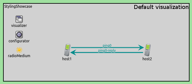
The network consists of two nodes, host1 and host2, which
communicate wirelessly, and we customize data link activity arrows. The
following configuration is used for the visualizer:
*.visualizer.dataLinkVisualizer.lineColor = "blue"
*.visualizer.dataLinkVisualizer.lineStyle = "dashed"
*.visualizer.dataLinkVisualizer.lineWidth = 6
*.visualizer.dataLinkVisualizer.lineContactSpacing = 15
*.visualizer.dataLinkVisualizer.lineShift = 32
Here are the differences between the default and the customized visualization:
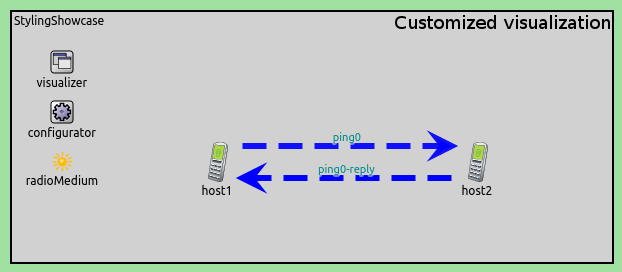
The lineColor parameter specifies the color of the arrow, and it
accepts English color names (more precisely, SVG color names) and
HTML-style RGB values. For the NetworkRouteVisualizer,
TransportRouteVisualizer and MobilityVisualizer modules,
lineColor may be set to a list of colors separated by commas, or to
the dark and light keywords which will be interpreted as a list
of good dark (light) colors. The lineStyle parameter can be set to
solid, dotted or dashed. Line width is controlled by the
lineWidth parameter. If there are multiple lines between the same
nodes, the space between the lines can be changed by adjusting the
lineShift parameter. The space between the end of the arrow and the
network node can be adjusted by setting the lineContactSpacing
parameter.
Customizing Labels
Lines and arrows often have labels placed next to them for displaying additional information. Customizing the font or color of such labels is often useful, for example, to highlight important information.
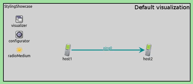
The example simulation can be run by choosing the Font configuration
from the ini file. The network is the same as in the previous example:
two hosts communicating wirelessly. We customize the font used in labels
on data link activity arrows.
To customize the fonts used in labels, we configure DataLinkVisualizer in the following way:
*.visualizer.dataLinkVisualizer.labelFont = "Courier New, 12px, bold"
*.visualizer.dataLinkVisualizer.labelColor = "red"
Here are the differences between the default and the customized visualization:
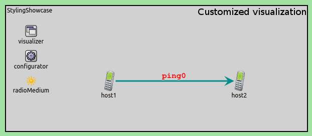
Font family, font size and font style can be set by using the
labelFont parameter. You can omit any value from the parameter if
you do not want to change that. For example, you can set labelFont
to "bold", so that font family and font size remain unchanged. The
labelColor parameter can be set to a single color by using a color
name or an HTML-style RGB value.
Labels are enabled by default. (Labels can be disabled by setting the
displayLabels parameter to false.)
For InterfaceTableVisualizer and StatisticVisualizer, the
font parameter is used instead of labelFont, and textColor
is used instead of labelColor.
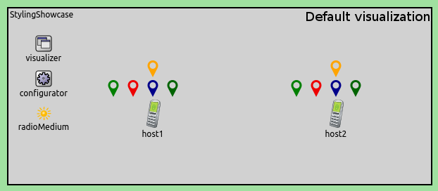
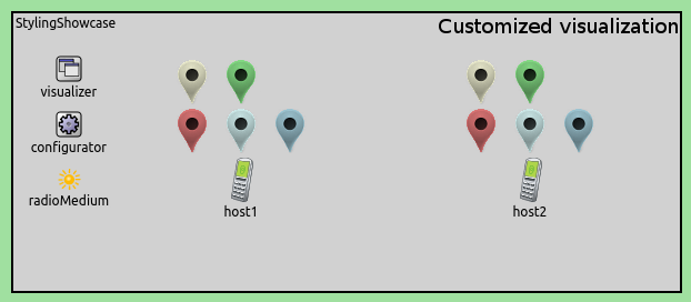
Customizing Icons
Some visualizers, such as TransportConnectionVisualizer, display icons. The following example shows how to customize icon appearance in INET.
The simulation can be run by choosing the Icon configuration from
the ini file. The network is the same as in the previous examples: two
hosts communicating wirelessly. This time, however, we add TCP traffic
between them, so that we can show how the icons displayed by
TransportConnectionVisualizer can be customized.
We use the following configuration to customize the transport connection icons:
*.visualizer.transportConnectionVisualizer.icon = "misc/marker2"
*.visualizer.transportConnectionVisualizer.iconColor = "light"
Here are the differences between the default and the customized visualization:
The icon parameter specifies the icon to be used. The OMNeT++ image
path is used to find the image, just like with the i display string
tag or the cIconFigure class. In our case, the misc/marker2 name
resolves to the inet/images/misc/marker2.png file:

The iconColor parameter allows you to colorize (tint) the icon. As
TransportConnectionVisualizer potentially displays several icons per
network node, the parameter accepts a (space-separated) list of colors,
and the module will cycle through them as it assigns colors to icons. It
also accepts the dark and light keywords, which will be
interpreted as a list of good dark (light) colors.
The LinkBreakVisualizer and PacketDropVisualizer modules have an
iconTintColor parameter instead of iconColor. However, note,
that iconTintColor can be set only to a single color. These
visualizers also have an iconTintAmount parameter. By adjusting
iconTintAmount, the colorization amount of the icon can be adjusted
between zero and one. If we set the parameter to zero, the icon will not
be tinted at all. If the parameter is set to one, the icon will be
tinted fully.
Placing Annotations
When many annotations are placed around a network node, being able to control their placement can reduce clutter and make the simulation more comprehensible.
The following example shows how to control the placement of annotations.
The simulation can be run by selecting the Annotation configuration
from the ini file. The network is the same as in the previous example.
The simulation will set up several TCP connections between the two
hosts, and TransportConnectionVisualizer will be used to visualize
them as marker icons.
We use the following configuration to place the annotation icons.
*.visualizer.transportConnectionVisualizer.placementHint = "bottom"
Here are the differences between the default and the customized visualization:
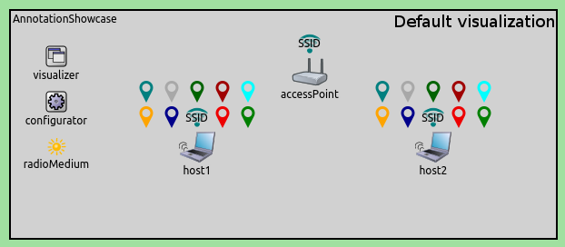
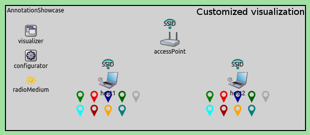
The placementHint parameter determines where the annotations will be
placed. The annotations can be placed in eight directions around the
node: topCenter, left, right, bottomCenter, topLeft,
topRight, bottomLeft, bottomRight. The placementHint
parameter may contain one or more of those words, denoting the preferred
direction(s). The word top is an abbreviation for
topLeft topCenter topRight; bottom, left, and right are
similar abbreviations. There is also any, which is the union of all
eight directions. When placementHint is set to any, annotations
will be placed as close as possible to the node.
The order of annotation positioning can be controlled by using the
placementPriority parameter that takes an integer. Zero is the
largest priority.
Sources: omnetpp.ini, StylingShowcase.ned
More Information
For more information, refer to the visualizers’ NED documentation.
Try It Yourself
If you already have INET and OMNeT++ installed, start the IDE by typing
omnetpp, import the INET project into the IDE, then navigate to the
inet/showcases/visualizer/canvas/styling folder in the Project Explorer. There, you can view
and edit the showcase files, run simulations, and analyze results.
Otherwise, there is an easy way to install INET and OMNeT++ using opp_env, and run the simulation interactively.
Ensure that opp_env is installed on your system, then execute:
$ opp_env run inet-4.6 --init -w inet-workspace --install --build-modes=release --chdir \
   -c 'cd inet-4.6.*/showcases/visualizer/canvas/styling && inet'
This command creates an inet-workspace directory, installs the appropriate
versions of INET and OMNeT++ within it, and launches the inet command in the
showcase directory for interactive simulation.
Alternatively, for a more hands-on experience, you can first set up the workspace and then open an interactive shell:
$ opp_env install --init -w inet-workspace --build-modes=release inet-4.6
$ cd inet-workspace
$ opp_env shell
Inside the shell, start the IDE by typing omnetpp, import the INET project,
then start exploring.
Discussion
Use this page in the GitHub issue tracker for commenting on this showcase.